BRANDING
Ritam Serene
- Industry
- Health
- What We Did
- Brand Strategy, Verbal Identity, Visual Identity
- Client
- Ritam Serene
Returning to the Root
In a world rushing towards quick fixes, Ritam Serene starts with a different belief: the body doesn't simply need to be fixed—it needs to be understood. Built around the principles of Ayurveda, the brand looks beyond temporary relief to encourage a deeper understanding of the body and its underlying needs.
Ritam Serene came to us with a clear ambition: make Ayurveda feel relevant to a new generation. Not by leaving its traditions behind, but by expressing them through a more contemporary, premium, and approachable lens. Our role was to shape that ambition into a brand system that could feel at home in the present while remaining connected to the wisdom it came from.
A Modern Expression of Ancient Wisdom
The challenge was finding the balance. Too much tradition could make the brand feel distant to a younger audience; too much modernity could strip away the character and depth that makes Ayurveda meaningful.
We developed the brand identity around that middle ground. Modern, minimal, and confident, with subtle cues drawn from its traditional roots. The visual language was designed to feel calm and considered rather than overly clinical or heavily Ayurvedic, giving Ritam Serene a distinct presence within a crowded wellness landscape.
Understanding Before Fixing
At the heart of the brand is a shift in perspective: from chasing symptoms to understanding the body.
This idea shaped the strategy and tone of Ritam Serene. Instead of speaking to Ayurveda as something belonging to the past, we positioned it as a way of thinking that can still have relevance in contemporary life. The brand speaks to a generation surrounded by instant solutions, inviting them to slow down, listen, and look deeper.
Designed for a New Generation
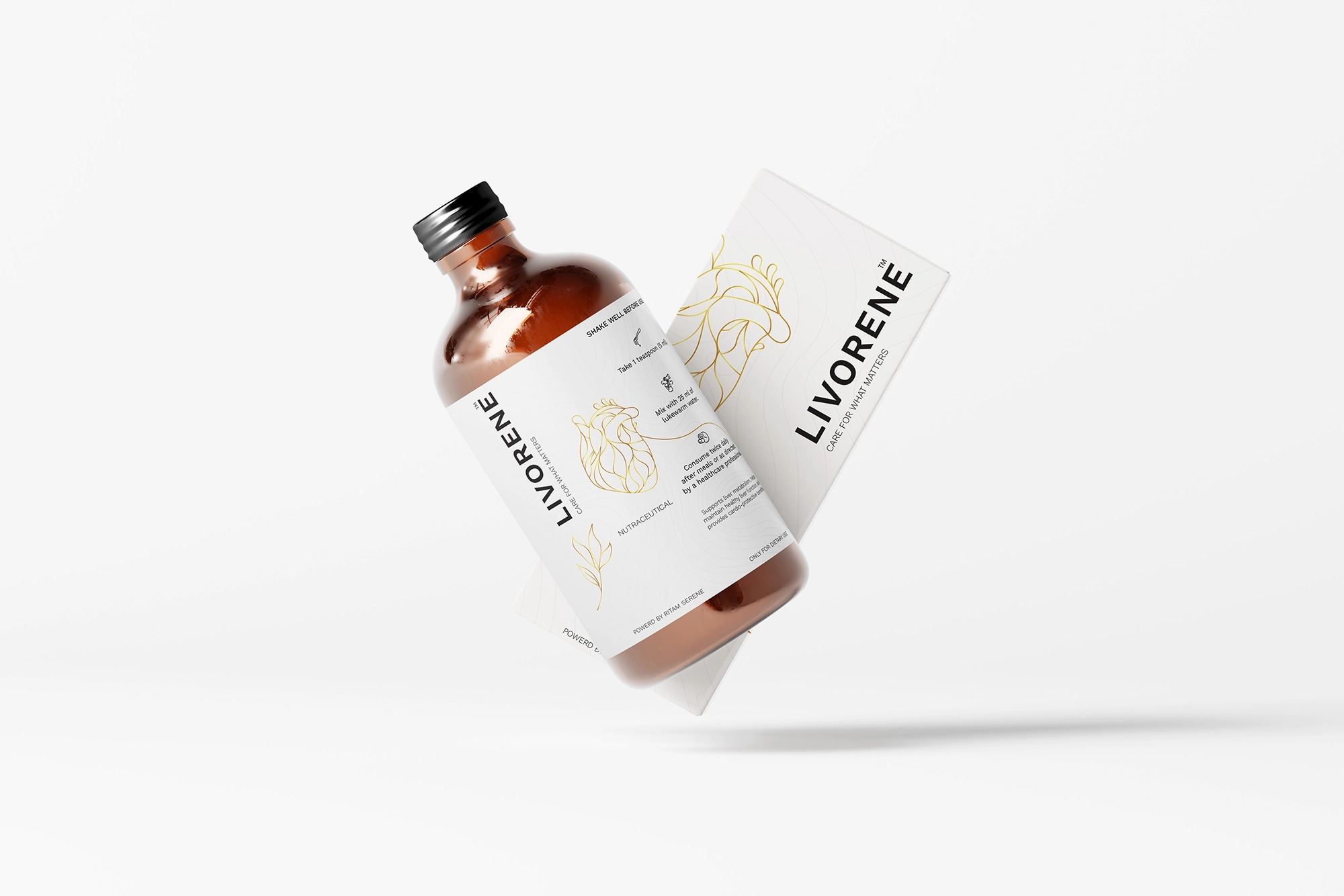
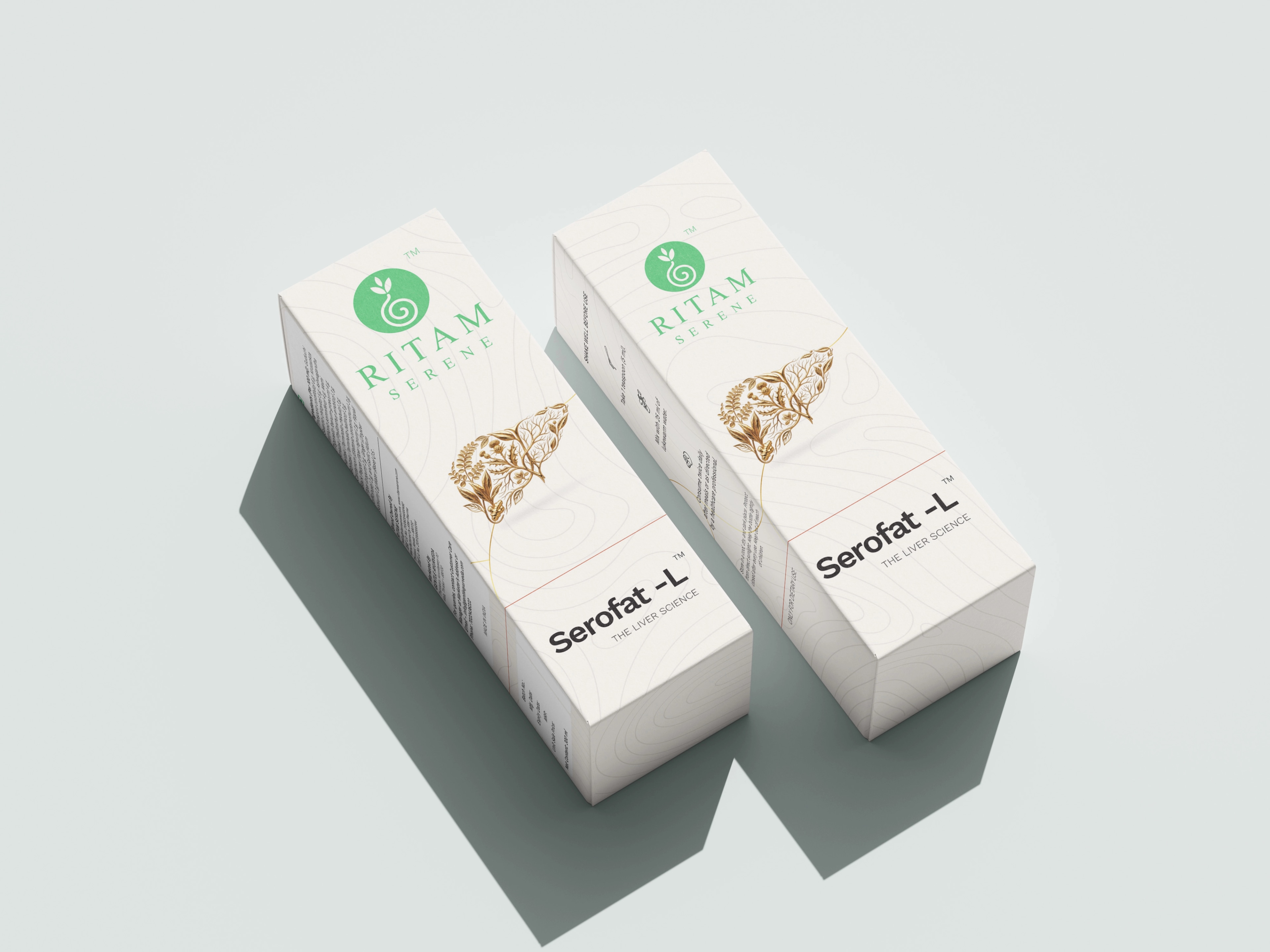
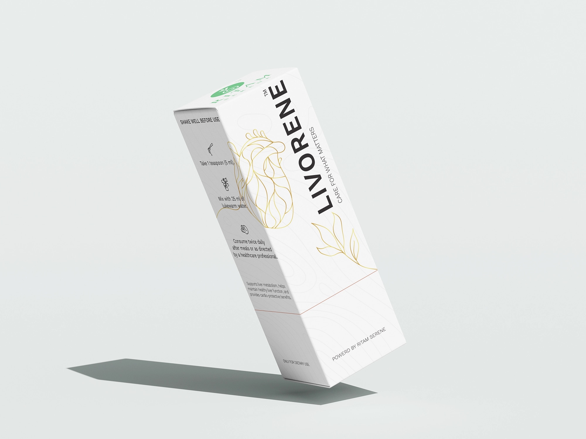
From the logo and complete visual identity to the packaging system, every element was created to carry the same balance of modernity and heritage.
The result is a premium Ayurveda brand with a contemporary voice—one that respects where Ayurveda comes from while creating a new visual and emotional space for where it can go next.
Ritam Serene is now a published brand, with its digital experience still to come. The foundation is set: a brand built not around the promise of a quick fix, but around a more thoughtful relationship with wellness.



 1234
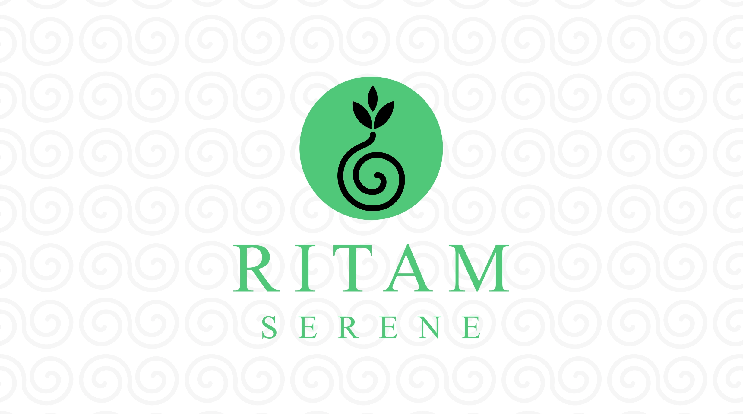
1234- 1“balance, healing, and overall well-being in life.”
- 2“difficult journey”
- 3“trapped spirit and the struggles within”
- 4“signifies wholeness, harmony, and sustained health.”
The logo is inspired by the Unalome symbol, representing the journey of healing and health. Its flowing form reflects the path toward well-being—sometimes smooth, sometimes winding—symbolizing challenges, recovery, and renewal along the way. It conveys that healing is not a straight line but a gradual process shaped by balance, care, and continuous growth.